Network Synergy Blog
Working with Images on the Web, Part 2 - Resizing Images
In a recent post, we talked about the various image formats you should use when sharing images over email or online. The goal is to generate an image (or images) that are the smallest file size possible to make them easy to share and quick to download, without reducing the overall quality of the image.
How to Resize and Optimize an Image for the Web
For this example, we’re going to be using Adobe Photoshop. For the longest time, Adobe Photoshop has been the top-shelf application for image editing. There are plenty of other applications out there that can do basic edits like resizing and compressing images, and if you are more familiar with another application that is similar to Photoshop, you might be able to follow along and get the general idea of what to do.
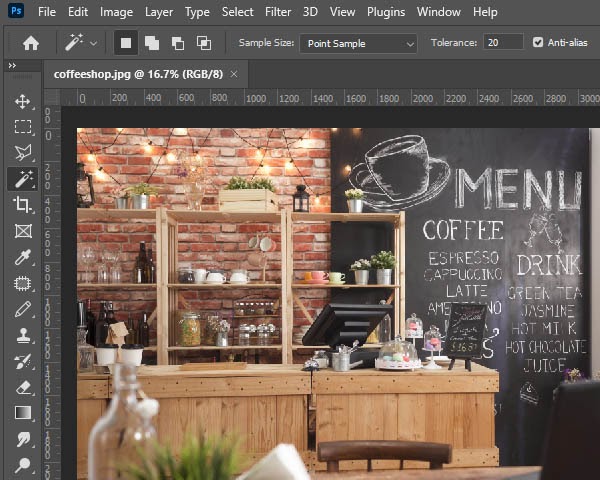
Let’s say we have a large photo of a coffee shop that we want to put on our website. Here’s what it looks like loaded in Photoshop:
Notice the percentage next to the file name? In our example, it says 16.7%.
This means we are zoomed out to the degree where the image can only possibly display 16.7 percent of the pixels.
This doesn’t mean that some of the pixels are off-screen—Photoshop isn’t being nitpicky about that. It’s telling you that your image is zoomed out so that your computer monitor isn’t displaying all of the detail in the image.
You can zoom in and out in Photoshop a few different ways. The easiest way is to hold down CTRL and Spacebar and left-click to Zoom In and hold down CTRL, Alt, and Spacebar while left-clicking to Zoom Out.
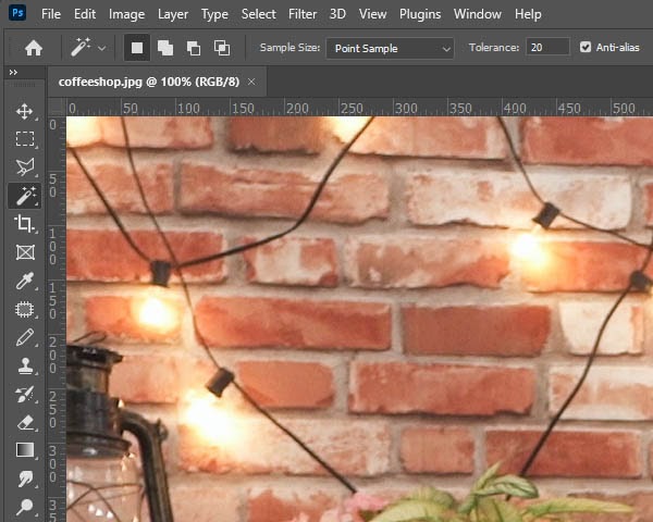
Here’s the same image at a 100% Zoom.
As you can see, we only see a small portion of the image now that we’re looking at the image at 100 percent zoom.
What Does This Tell Us?
This image is big!
It’s important to remember that by zooming, we didn’t change the size of the image. We just changed the percentage of pixels of the image our monitor is displaying. At this zoom level, for this particular image, the image itself scales past the confines of our monitor.
This isn’t a bad thing. This means we’re working with a high quality image. There’s a lot of potential there. We could print this image and it will likely come out sharp and crisp with lots of detail. However, if we were to put this on a website, as is, it’s going to be massive. It will be larger than most users’ screens will be able to display.
It’s much bigger than it needs to be, once the web is concerned.
Most stock images you purchase, and most photos that come off of a modern smartphone camera or digital camera are going to be massive, as far as their dimensions go.
One important thing you need to remember before we continue—you should only shrink images down. Taking a small image and blowing it up usually requires a graphic designer, if it’s possible at all. Otherwise you’ll lose a lot of image quality.
Oh yeah, and save an original copy! We mentioned this in the last blog, but it’s worth mentioning again!
Step 1 - Determine the Size That You Need
This step can be tricky unless you have a bit of a background in graphic design. For your website, it’s going to depend on where the image is going. You may need to eyeball it, guesstimate, or even do some trial and error. There’s a pretty neat trick you can do with the Firefox browser, if you are replacing an image that’s already there.
- Load up Firefox and navigate to the page you want to put the new image.
- Right-click the image you want to replace and go to View Image Info.
- A window will pop up displaying your image and some information about it.
- Look for Dimensions. That will show you the width and height of the image in pixels.
- You can use that as a reference for the new image.
It’s also about eyeballing it. Here are some sizes you can use as a point of reference.
- 3840px is the width of a 4k Ultra HD monitor or television screen.
- 1920px is the width of a standard high definition monitor or television screen.
- 1080px is the width of most Instagram images.
- 820px is the width of a Facebook Cover Image on a desktop or most laptops.
- 272px is the width of Google’s logo in the center of Google.com on most desktops and laptops.
Here are some square images so you can get an idea of their size. Keep in mind, if you are viewing this blog on your smartphone, the sizes are going to vary a little, since our website will scale down to fit your smartphone screen. For best results, pull this blog up on your desktop.
Hopefully these references will help you out.
Step 2 - Zoom to 100% in Photoshop
In the bottom left corner of Photoshop, below your image, you’ll see the Zoom percentage. Click the percentage and set it to 100%. You can also manipulate this by Zooming In by holding down CTRL and Spacebar while left-clicking the image and Zooming Out by holding down CTRL, ALT, and Spacebar while left-clicking the image.
We’re doing this to ensure that we get a good visual example of how large or small the image is when we’re done. If you are zoomed in or out, Photoshop won’t display the image at the correct size for you. This makes it easier when you are estimating the size.
Step 3 - Resize Your Image
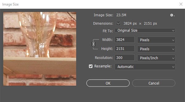
Click on the Image Menu and go to Image Size.
You should see this window:
While in the Image Size window:
- Make sure that the Width and Height are set to Pixels (as opposed to inches, centimeters, etc.)
- Also, make sure the brackets next to the link icon (pointing at Width and Height) are on. Clicking on the link icon will toggle this. This will ensure that you keep the same proportions of the image while you resize it.
- Type in the new width or height you want to shrink the image down to. If you change one field, the other should change with it.
- Typically, leaving Resample checked, and keeping it on Automatic will be your best bet.
- Click OK to resize your image.
Of course, if you are a graphic designer and you’ve been working in Photoshop for years, you’ll probably have your own process for doing this. We’re trying to make it as easy as possible for the average user.
Step 4 - Save Your Resized Image
Finally, it’s time to save the image.
In our last blog, we talked about the various image formats you should consider. Since we’re working with a photograph, the best format to use is JPEG.
In Photoshop, go to File > Export > Export As.
The Export As window should appear:
This will give you a preview of your image. Use the + and - icons at the bottom center to zoom in to your image to 100 percent.
On the right, under File Settings, make sure your Format is set to JPG.
Set the Quality Option by dragging the slider to the left. You’ll want to carefully examine the preview as you move the slider. If you start to notice the image degrade in quality, stop, and nudge the slider to the right.
Every image is going to be a little different, but most of the time, you should be able to set the quality somewhere between 40-and-70 percent without degrading the actual quality of the image.
This is important. That quality slider is what determines the file size of the image. Users will be able to download the image faster if the file size is as low as possible, but going too low will cause the image to look over-compressed.
The best place to look in your image for degradation is where high-contrast colors connect. Look for light and dark objects. If you lower the quality too far, you’ll start to see weird artifacting and shapes start to appear around hard edges.
Once you are ready, click Export and you’ll be prompted to give your new image a file name. Just make sure you don’t save over the original!
We hope this guide helped! For more tips and tricks, keep coming back to our blog. If you need technical support, be sure to give us a call at (203) 261-2201!


Comments